


Unit 30 LO3
- 2. Location Recce Location Time Date Why? The photo shoot had been taken place on the 6th of February 2017 and it was between 15:00 – 16:00 The photo shoot was taken on this date because it was one of the tomes when me and the model had a chance to go out and take the photos. As for laws and regulations if I had taken my photos outside in a public area or in private property or land I would have had to get permission to use that area. If it was in public and I got a member of public in the photo I would have to ask for their permission. Also I had to ask the model for their permission to take and manipulate the photo of them for my front cover and DPS. Picture Needed Shot type Props/Equipment Lighting Costume Person Why? The shots used in my magazines were mid shots and we didn't use any props. Furthermore the lighting used was natural. During the photo shoot the model changed positions to try and get a good picture for the front cover and DPS. I think that the mid shot would work better rather then any close up shots as you can see his outfit and his body langue. Also with the natural lighting it gives a better quality image. I had the model change positions a few times to get a good picture for the front cover and DPS as I didn't’t want it to be the same photo as that would make the magazine boring. Permission Needed Contact needed to be made Evidence of this? The photo shoot was taken in a place where there was no permission needed to use the area. The reason why I took the photo outside again a white wall was so I could get the natural lighting and with the white wall it would be easier to edit later on, on Photoshop, so this saves time. Hazards and risks Location specific Why? The hazard risk was very low as I took the photo in a hall way and I didn’t use any props. This is because there wasn’t any hazards at all in the area I took the photos.
- 3. Test Photography This is the photos that I took for my front cover and DPS. For my front cover photo is the second photo from the left and my DPS photo is the third photo from the left. I chose to use these images as they looked the best on the front cover DPS.
- 4. Equipment Before taking my photos for my front cover and DPS I had to get some equipment to ensure that my photos were the best quality that they could as they have to look professional for the magazine. The equipment that I used to take the photos was a white background and a Cannon camera. I used a Cannon camera because this is a good camera and produces good quality images. I used a white background because it would make it easy for me to edit in Photoshop. Equipment cost Office space £212,480 Apple MacBook (x25) £29,975 Adobe C5.6 master collection £9,179 Desks (x25) £937.25 Chairs(x25) £1,249.75 Printer £79.99 Cameras (x3) £687 Pens £9.58 Paper £9.16 Total 254,606.73
- 5. Staff and cost (LOSS) As you can see from the table on the left it shows the staff jobs and how much they will be paid. The salary is a fair amount due to the nature of the job and the higher the hill level the higher the salary will be. For example an publisher and editor is a much more higher skilled job then a photographer for the magazine. Staff Position Salary Publisher 37,500 Editor 32.500 Journalists 32,500 Writers 37,500 Photographers 30,750 Marketing 32,500 Finance 37,750 Design 37,500 HR 32,500 Total 311,000 https://www.totaljobs.com/salary- checker/salary-calculator
- 6. Marketing the magazine (loss) I will market the magazine on all platforms possible which includes apps, also I will be marketing my magazine on billboards and other magazine advertisement which is a form of below the line marketing. One major platform would be Facebook. This is because Facebook has millions perhaps billions of users who use it and it is without a doubt that someone would come across the advertisement on it. Another major platform is Instagram. I will try and advertise on it because millions of people are on it and there is always and advertisement or two when scrolling down to look at other peoples stories. Snapchat is also another major platform, however not everyone looks at the news side on it therefore we do not want to waste money on advertisement on a platform that no one even looks at. These are all forms of above the line marketing which is good as the possible amount of people that will e able to see the magazine is so much more higher hen any other type of marketing. To advertise my magazine on Facebook it will cost £28.72 a month, £344.64 a year.
- 7. Final front cover and DPS
- 8. Interview Draft Hello Tom How are you? I am good thank you. How are you? I’m good, how do you feel about your new album release? I feel excited and can’t wait to see the response from the fans, it’s probably my best album yet with a couple of unheard bonus tracks. It will be released sometime in 2017. How long did it take to recorded the whole album? It toke me quite a long time, about 3 years as I wrote the whole album myself. Also a lot of effort was put into each song and some personal stories are included I them. Are you looking to perform in upcoming festivals? Yes, I would like to perform at one of the festivals in 2017 summer as I feel that would really boost my publicity and my new album. Also I think it would be good seeing all my fans there supporting me. Also this will be my first festival I would have done. Will you be promoting yourself before the festivals or concerts? Yes I will talking about it on my social pages link Snapchat and Instagram to try and get as many fans only as I can. Also I will be giving away tickets on these social media pages as well. I will be also going to radio stations taking about my new album and upcoming festival/concerts. Will you be performing your new album there? Well I’m hoping to, if it is well responded to I will be defiantly be performing it at a festival but it really depends on the response of the release. I also want to publicize my album more and this will be the a good place to do this. What has your friends and family said about your rise? My family and friends are obviously proud of me for what I am doing. Also my close mates come with on tours and to festivals. Obviously, I've lost some mates over doing this as I spent all my time in the studio and I never spent a lot of time with my mates just only my close ones that stuck by me. What have the old mates said to you about this? Well….. Ha ha they have just been saying that I’m cocky and and up my self thinking I’m so sick. It hasn't really effected me cause I have shut them out of my life, however I have mentioned some lyrics so listen for them. What has been your inspiration for making music? Erm when I was younger I was always getting into to trouble at school and stuff and my mum used to tell me I was useless and I was never going get anyway in life. So I wanted to prove to myself and to my family to I could actually make something out of my life, so I turned to music, so I went to my music teacher and they gave me a studio to got to. Ever since then iv e been trying to pursue a career in music. Now I am here and I can say to my mum that I made something out of my life and make myself proud. Well thank you for your time and I hope to see you doing big things in the future Yes, thank you for having on here I really appreciate it and it means a lot to me.
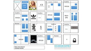
- 9. Name: Harry Dyerson Candidate Number: Contents Editorial Con tent Main Image Masthead Headline Article Headline Article Headline Article Article Main DPS Reviews Headline Article Ar tic le Headline Article Article Headline Article Reviews
- 10. Contents Editorial Con tent Headline Article Headline Article Headline Article Article Main DPS Reviews Headline Article Ar tic le Headline Article Article Headline Article Reviews This is my magazine flat plan for my magazine ‘President’. A flat plane is what my magazine would look like on the inside.
- 11. Chosen Fonts Bad Stories by imagex yborg Rooster à € by Iconian Fonts I have chosen this font as it is very similar to my magazine of inspiration. This is good as I am not re- inventing the wheel. As most magazines have bold fonts. I have chosen this font as it is similar to ‘Vibe’ but not as similar as the other font. However this font is more squashed together.
- 12. House Style - PRESIDENT The color scheme to my first magazine is light blue and a light grey. As these two colours contrast each other. The colour blue connotes loyalty highlighting that my magazine will contain accurate information. The colour blue is easy to see and connotes my magazine will have pure and trustful information. The light grey denotes a neutral colour, the connotations behind the colour grey is that it is quite cool and contemporary. Furthermore, I will have social media logos on my page to keep up with the brand identity and it is an example of cross-media convergence, ‘digital natives’ (Prensky 2001) will like being “courted across multiple media platforms” (Jenkins 2006).
- 13. Magazine One Hand Drawn Drafts (Front Cover)
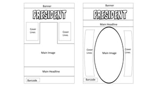
- 14. Main Image Main Headline Barcode Cover Lines Cover Lines Barcode Main Headline Cover Lines Cover Lines Main Image Banner Banner
- 15. Feedback of front cover Question three of my SurveyMonkey was ‘Would you change anything about my front cover? If so why?’ I chose this question so I could find out what other people thought about my front cover. The two most popular answer was ‘ To make the masthead stand out’ and ‘ To change the main image.’ The sixth question is ‘What would you rate my front cover out of 10?’ I chose this question to find out people initial thought on my front cover. The average rating was 7/10. This means that I have room to improve.
- 16. FINAL MAGAZINE FRONT COVER I chose to put the main image of the artist overlapping the masthead because this creates synergy between the magazine and the artist. This means when the reader looks at the front cover of the magazine they can say I like the artist and I like the magazine so they put the two things together to make one. I decided to make the name of the artist overlap the main image of the artist because this makes it a stand out when the magazine is on the shelve next to other magazines. This means when people look at it they know who the artist is on the front cover. I added in the social media links above the barcode. This is called the technological conversion, so people can find the magazine online as well as having the paper magazine.
- 17. Feedback of DPS The fifth question was ‘What could I change about my DPS?’ I chose this question as it allows me to get other peoples opinion on my DPS and they can give me feedback on what I could change about my DPS. The main reply was to fill the empty space up.
- 19. Front Cover step by step • The first thing I did was open Adobe Photoshop, them I clicked file new and set the canvas size to A4. Then I added in my ruler lines by using the Ruler Tool for each different feature of my front cover for example the masthead and barcode. This is because with these ruler lines everything can line up which makes the end product of the front cover look professional and tidy. As seen in this image I have used the ruler tools and the end product looked really nice and professional. • For adding in all my text on the front cover I was the Text Tool which allows me add in a text box onto the canvas and start to type. For certain bits of text I right clicked on them and went to Effects and added a Stroke around the edges to make the text stand out more. This can be seen in the image below.
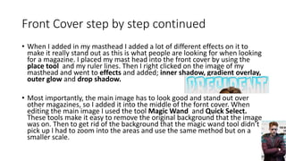
- 20. Front Cover step by step continued • When I added in my masthead I added a lot of different effects on it to make it really stand out as this is what people are looking for when looking for a magazine. I placed my mast head into the front cover by using the place tool and my ruler lines. Then I right clicked on the image of my masthead and went to effects and added; inner shadow, gradient overlay, outer glow and drop shadow. • Most importantly, the main image has to look good and stand out over other magazines, so I added it into the middle of the fornt cover. When editing the main image I used the tool Magic Wand and Quick Select. These tools make it easy to remove the original background that the image was on. Then to get rid of the background that the magic wand tool didn’t pick up I had to zoom into the areas and use the same method but on a smaller scale.
- 21. DPS step by step • One of the I used in my DPS is the drop capital to start my article. To do this I highlighted the letter that I wanted to make big, then I clicked this button. This then allows me to choose what size I want the letter to be. I did this because this makes my DPS article look more professional. This is displayed in the image below. • Another feature of my DPS is the quote from the artist. To do this I went to window then text wrap. Then a pop up comes up and I can select what I want the quote to look like. This is good because then it stands out in the article.
- 22. DPS step by step continued • Furthermore the main image of the DPS is important because this is what people will look at first. I did this on Photoshop and inserted in into InDesign. His can be seen in the image on the bottom left. • The final feature of my DPS is the background gradient. This follows my colour scheme. The way I did this was by clicking on this button. I chose to do a gradient because I think this looks professional and modern. This can be seen in the image in the bottom left.
- 23. Risk Assessment Before taking the pictures of the person I asked them to fill out a consent form which means they have agreed to be having a photo to be published/manipulated once signed. Area Assessment When looking for a location for the picture to be taken of I had to check to see of there any possible hazards that could harm the person. I looked at the area I toke the photos in and it was safe.
- 24. Conclusion In this LO I was able to produce material for an original UK-based print media product.
Editor's Notes
- LINK TO WEBSITE
- CREATE FACEBOOK PAGE FIND OUT HOW MUCH IT IS TO MARKET ON FACEBOOK