Location via proxy:   [ UP ]  
[Report a bug]   [Manage cookies]                
SlideShare a Scribd company logo
Using In-Design to create newspaper and magazine pages

1. Open In-Design using the ID logo on your dock or find it on
applications in your hard drive.

2. Use the file menu to create
a new document.

3. Choose A4 for your paper size.
4. Click on layout – margins and columns.
5. In the columns box – type in 5.
6. You will now get five column guides on your
page.

7. Find the toolbar on Window at the top and scroll

The main
cursor tool

down to Tools and ensure this is ticked so your toolbar
is visible.
8. The tools are similar to those in Word, so if you
click on the hand tool you will be able to move
objects around.

Picture box

9. This is the text box tool.
Click on this an then draw
a text box on your page.
10.

You can now write words in the

box.
Hand tool
11. You can make placing your pictures and text boxes
easier by using the guides across to anchor your boxes.
Go to

Type in 33 on rows, number
and this is what your page will
look like….

12. To make your boxes fit to the nearest
Snap to Guides in the view menu.
13. To import a picture go to Place in
the File menu.

14. To create a border/frame on your picture, use the
Window drop-down menu and select stroke. Here
this will allow you to pick the width of your frame for
a picture – it is usual for pictures to have a 1pt
frame.

15. The window menu has lots of tools to help your pages
look their best.
•

The swatches menu allows you to fill boxes with
colour

guide line, choose
•

The text wrap palette allows you to create a runaround on a picture – which
means you can
the text will run

around your picture.

The type menu

gives you a much bigger choice of

fonts than

•

place a picture on the page and

Photoshop and because of the

use of text
boxes the look

of

your page will be much
cleaner on In-design.

16. Remember that every box you draw is like a stack
cards in a pile, you can arrange them to sit behind

of
one

another and layer up images and words – just use the Object drop-down menu and
go to:
AS Production Piece
Remember to research thoroughly the type of music magazine you are going to
create. The main way to show creativity is to not just copy from a successful magazine but
to actually use it to help you create something original which follows the format of a
magazine.
Getting Started
All magazines have a brand identity. This is really important to create a sense of
cohesion throughout the magazine.
• Fonts – you should choose a main headline font, a body font and secondary
headline fonts.
• Your front page will have many fonts on it – they are there to distinguish
between articles and to grab the readers’ attention.
• Remember – often less is more when it comes to choice of fonts – a page
that’s too busy will often detract from the articles.
• Be consistent in your choices of colour – have a batch which clearly define
the different pieces of your magazine.
• Text and colour – remember if you are placing text on a background, whether
it’s a picture or a block of colour – can you read it? WOBs (white on black)
are very popular to make a secondary story or an information panel stand out
– say a paragraph on a star’s hits – but make sure your body text is clear.
• Watch out for colours – never put red on green, or yellow on blue – it looks
sickly and is terrible to read! Stand back from your page – can you read it
from a distance?
• Headlines can be as big as you like in a magazine – but more that 150pt and
it will take over the page.
• Body text in articles should be no more than 9pt – any bigger and it will look
simplistic.
• Use standalone paragraphs
under
headlines – great to
introduce
your interview and these can
be much
bigger than the body text.
• Don’t be afraid to leave
white
space and space around
photographs.
• Body text in columns should
be a serif
font such as Times New Roman, fonts with curly bits on are easier to read in
columns in 8pt. If you have smaller pieces of text, sans serif fonts are okay to
use. You can break up text with crossheads to break up the column, or use a
pull-out quote.
Rewrewrewrewrew
rewrewrewrewrewrewrewrew
rewrewrew

“I was very happy
with the first video

”

Fdsfdsafdsafdsafdsafds
afdsafdsafdsafdsafdsafd
safdsafdsafdsafdsaaaaa
aaaaaaaaaaaaaaaaaaa
aaaaaaaaaaaaafdsafds
afdsafdsafdsafdsafdsafd
safdsafdsafdsafdsafdsaf
dsafdsafdsafdsafdsafds
a

Crosshead

More Related Content

Using in

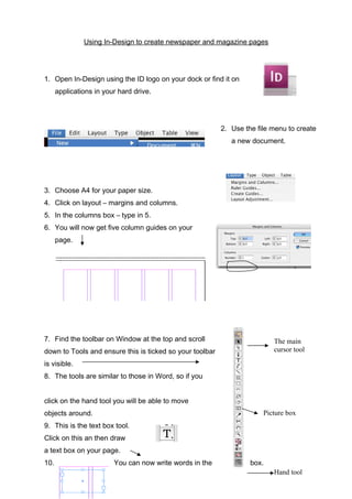
  • 1. Using In-Design to create newspaper and magazine pages 1. Open In-Design using the ID logo on your dock or find it on applications in your hard drive. 2. Use the file menu to create a new document. 3. Choose A4 for your paper size. 4. Click on layout – margins and columns. 5. In the columns box – type in 5. 6. You will now get five column guides on your page. 7. Find the toolbar on Window at the top and scroll The main cursor tool down to Tools and ensure this is ticked so your toolbar is visible. 8. The tools are similar to those in Word, so if you click on the hand tool you will be able to move objects around. Picture box 9. This is the text box tool. Click on this an then draw a text box on your page. 10. You can now write words in the box. Hand tool
  • 2. 11. You can make placing your pictures and text boxes easier by using the guides across to anchor your boxes. Go to Type in 33 on rows, number and this is what your page will look like…. 12. To make your boxes fit to the nearest Snap to Guides in the view menu. 13. To import a picture go to Place in the File menu. 14. To create a border/frame on your picture, use the Window drop-down menu and select stroke. Here this will allow you to pick the width of your frame for a picture – it is usual for pictures to have a 1pt frame. 15. The window menu has lots of tools to help your pages look their best. • The swatches menu allows you to fill boxes with colour guide line, choose
  • 3. • The text wrap palette allows you to create a runaround on a picture – which means you can the text will run around your picture. The type menu gives you a much bigger choice of fonts than • place a picture on the page and Photoshop and because of the use of text boxes the look of your page will be much cleaner on In-design. 16. Remember that every box you draw is like a stack cards in a pile, you can arrange them to sit behind of one another and layer up images and words – just use the Object drop-down menu and go to:
  • 4. AS Production Piece Remember to research thoroughly the type of music magazine you are going to create. The main way to show creativity is to not just copy from a successful magazine but to actually use it to help you create something original which follows the format of a magazine. Getting Started All magazines have a brand identity. This is really important to create a sense of cohesion throughout the magazine. • Fonts – you should choose a main headline font, a body font and secondary headline fonts. • Your front page will have many fonts on it – they are there to distinguish between articles and to grab the readers’ attention. • Remember – often less is more when it comes to choice of fonts – a page that’s too busy will often detract from the articles. • Be consistent in your choices of colour – have a batch which clearly define the different pieces of your magazine. • Text and colour – remember if you are placing text on a background, whether it’s a picture or a block of colour – can you read it? WOBs (white on black) are very popular to make a secondary story or an information panel stand out – say a paragraph on a star’s hits – but make sure your body text is clear. • Watch out for colours – never put red on green, or yellow on blue – it looks sickly and is terrible to read! Stand back from your page – can you read it from a distance? • Headlines can be as big as you like in a magazine – but more that 150pt and it will take over the page. • Body text in articles should be no more than 9pt – any bigger and it will look simplistic. • Use standalone paragraphs under headlines – great to introduce your interview and these can be much bigger than the body text. • Don’t be afraid to leave white space and space around photographs. • Body text in columns should be a serif font such as Times New Roman, fonts with curly bits on are easier to read in columns in 8pt. If you have smaller pieces of text, sans serif fonts are okay to use. You can break up text with crossheads to break up the column, or use a pull-out quote. Rewrewrewrewrew rewrewrewrewrewrewrewrew rewrewrewrewrewrewrewrew rewrewrewrewrewrewrewrew rewrewrewrewrewrewrewrew rewrewrewrewrewrewrewrew rewrewrew “I was very happy with the first video ” Fdsfdsafdsafdsafdsafds afdsafdsafdsafdsafdsafd safdsafdsafdsafdsaaaaa aaaaaaaaaaaaaaaaaaa aaaaaaaaaaaaafdsafds afdsafdsafdsafdsafdsafd safdsafdsafdsafdsafdsaf dsafdsafdsafdsafdsafds a Crosshead