UX Army of One
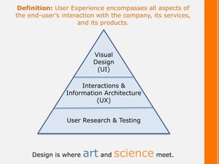
- 2. Definition: User Experience encompasses all aspects of the end-user’s interaction with the company, its services, and its products. User Research & Testing Interactions & Information Architecture (UX) Visual Design (UI) Design is where art and science meet.
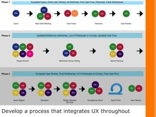
- 3. Product Owner SCRUM Master Developer Quality Assurance Decides what to focus on and defines the product Helps the team follow the process Decides how the user stories & designs will be realized Decides how acceptance criteria will be tested Writes user stories & explains the voice of the customer Removes impediments for the team Creates code to realize the user stories & designs Creates tests for stories using the criteria as a guide Prioritizes the product backlog Helps the PO maintain the product backlog Seeks clarifications when needed Tests code and communicates the outcome Accepts all user stories when criteria has been met Helps the team to run itself Collaborates with designer when possible Seeks clarifications when needed Explains work done to other devs and QA Demonstrates successful products to PO & designer No silos! Create your team structure first.
- 4. Combine Agile & Lean UX methods
- 5. Develop a process that integrates UX throughout
- 6. User Research & Testing
- 7. Research Tools and Methods • Personas • Google Analytics • Eye Tracking Heatmap • A/B Testing • Surveys • Contextual Inquiry (Give it a friendlier name like, “ridealong”) • Working Group – meet every other week with a group of users, between 3- 7 is ideal, during a project cycle. Use conferencing software like WebEx. Use cameras, get to know the real people. Look at designs together before they reach development, sketches are fine! Iterate and come back with updates for the next session. Create-Burn-Learn • UAT Testing / Beta / Sandbox environments • Don’t live by a script, invite organic conversation into an interview • Great crash-course article here: UX Research *Find what works for you and your product but don’t rely strictly on analytics and metrics. You have to get in the field and meet the real users. Cultivate relationships=creating real empathy.
- 9. Tools • Pen & Paper should always be your first weapon • A whiteboard is perfect for iterating with developers and helping them understand they are designers too! You need to listen to everyone on the team; they all have good ideas. • Adobe Creative Suite products • Visio • Omnigraffle • Axure • Balsamiq • Sketch • InVision • Justinmind • Keynote *Look for free trials and if you can, buy a student license!
- 10. Application of the Gestalt principles to Interaction Design ©Troy Pickering
- 11. Figure out what type of deliverables you need and throw away the rest. Be lean, be sketchy, and don’t waste time on pixel perfect without a damn good reason.
- 13. Visual Design Which is the best BLUE for a page title? Which is the best BLUE for a page title? Which is the best BLUE for a page title? Which is the best BLUE for a page title? Which is the best BLUE for a page title?
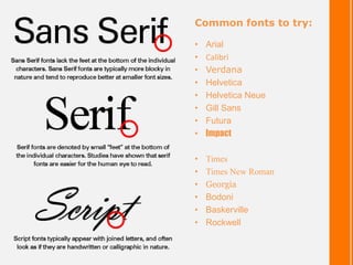
- 14. Common fonts to try: • Arial • Calibri • Verdana • Helvetica • Helvetica Neue • Gill Sans • Futura • Impact • Times • Times New Roman • Georgia • Bodoni • Baskerville • Rockwell
- 15. Google Fonts Font Awesome icons
- 17. But what if, after creating all that…
- 18. You need a Design Guide At minimum: • Company info • Product info • Logo • Iconography • Color palette • Typography • Components • Layout • Any key screens or elements
- 20. Points to remember • There are 3 main parts to being a UX Army of One – Research, UX, UI • You must have info about the end-user to make solid design decisions. Otherwise, you’re just guessing and that’s dangerous. • UX is the “how” of the thing. How will a user interact with my product, how will it flow, how is the info structured. • UI is the “pretty,” but the pretty is powerful. Consider how the look is translating your product/brand to the user and whether you need to create a strategy with Marketing. • Don’t be afraid to fail, just do it quickly. • Share your ideas/deliverables as soon as possible. I’d rather have a user tell me the sketch I spent 3 minutes on is all wrong than the mockup that took an hour. • You will need a team and a process to succeed. No silos! You must be the one to get everyone to collaborate together. Candy helps.


