


UNIT 13 LO2
- 1. OCR – Level 3 Cambridge Introductory Diploma in Media Unit 13: Planning and Pitching a Print based Media Product P2 Evidence Name: Tom Hibbert Candidate Number: 2063 Center Name: St. Andrew’s Catholic School Center Number: 64135 Set Brief - Print Project/Brief – Music Magazine & Promotion Idea Generation
- 2. Contents 1. Mind Map Idea One – Slide 4 2. Mood Board Idea One – Slide 5 3. Mood Board Conclusion – Slide 6 4. Mind Map Idea Two – Slide 7 5. Mood Board Idea Two – Slide 8 6. Mood Board Conclusion – Slide 9 7. Summary of Ideas – Slide 10 to 12
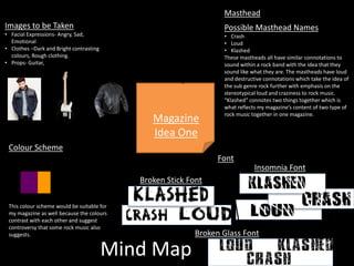
- 4. Mind Map Masthead Possible Masthead Names • Crash • Loud • Klashed These mastheads all have similar connotations to sound within a rock band with the idea that they sound like what they are. The mastheads have loud and destructive connotations which take the idea of the sub genre rock further with emphasis on the stereotypical loud and craziness to rock music. “Klashed” connotes two things together which is what reflects my magazine’s content of two type of rock music together in one magazine. Colour Scheme Magazine Idea One This colour scheme would be suitable for my magazine as well because the colours contrast with each other and suggest controversy that some rock music also suggests. Images to be Taken • Facial Expressions- Angry, Sad, Emotional • Clothes –Dark and Bright contrasting colours, Rough clothing. • Props- Guitar, Insomnia Font Broken Stick Font Broken Glass Font Font
- 5. Mood Board for magazine idea number one.
- 6. Mood Board Conclusion Artists To conclude, my mood board has influenced me to select what bands I would like to include in my magazine. I have three bands on my Mood Board. Green Day, Tonight Alive and My Chemical Romance. These are not only personal favoured artists but artists that represent rock music and have been in the rock music business for a long time. To feature them in the magazine would show the dedication to rock music that my target audience is looking for. Font To conclude my mood board and the ideas that it has influenced me on about font the three fonts that I have narrowed my choice to are called ‘Broken Stick’, Broken Glass’ and ‘Insomnia’. Just the name of the fonts have rock element and these choices are based on font used by two of the artists themselves. Green Day uses ‘Insomnia’ font for their poster sand general name as it appears cracked and broken but is still able to read. My Chemical Romance uses similar text to ‘Broken Stick’ but is not fully readable. ‘Broken Glass’ was chosen as one of my choices for font as well not because of other artists but because I like the way that the Broken Stick font looked and Broken Glass provided a similar look but with a more easy to read element. Theme This mood board of ideas has influenced my choice of theme not to be a contrast in dark rock but to make my magazine a unique rock magazine in a modern timeline with different appearances in the rock music genre.
- 7. Mind Map Magazine Idea Two Bangtime Font Strike Font Boom Box Font Font Masthead Possible Masthead Names • Bang • Boom • Strike These mastheads would be suitable as they all have quite gloomy and dark connotations. The mastheads also have a flashing connotation when picturing a ‘Bang’, ‘Boom’ or a ‘Strike’. The masthead would make the reader symbolise my magazine with fire, bright colours and destruction. This would suit this magazine idea because this would match the colour scheme. Colour Scheme This colour scheme would be suitable or the magazine because they are quite dark colours which most rock magazines have. Images to be Taken • Makeup- Gothic • Clothing-Dark, ripped, gothic • Hair-Spikey/Coloured • Facial Expressions-Anger
- 8. Mood Board for magazine idea number two
- 9. Mood Board Conclusion Artists This mood board has confirmed my feelings on choosing the three continuous artists seen in the first mood board for my magazine. Both my mood boards have shown me that they suit both colour schemes and themes that the magazine will either have/not have. Font The fonts I am depicting from my mood board to use are BOOM BOX, STRIKE and BANGTIME. My mood board concludes that the BANGTIME font is too difficult to read and is quite a broken piece of text which may be off putting to the reader and target audience. STRIKE is quite a piece of futuristic font which my mood board has shown in context of what the magazine would contain, the font looked out of place and contradicting to the theme and age of rock that would be included in the magazine. BOOM BOX had similar connotations of futuristic aesthetics such as the STRIKE font but not to the extent of contradicting the actual magazine. This has concluded that I will use the font BOOM BOX. Theme The mood board contains quite dark images and especially has a dark, gloomy colour scheme that would isolate and limit the magazine to one specific theme of rock music. If I used this theme I would be limited and have to possibly reselect the artists featuring in it.
- 10. Summary of Ideas Genre The genre of the magazine I plan to create will be a rock music genre. This will include artists associated with this genre, for example Green day, Tonight Alive and My Chemical romance. These bands are from the same genre which will make it suitable to include them in the magazine. Size I plan to have my magazine sized at 8cmx11cm. I have chosen theses specifications because it is the average magazine size and I am basing my magazine on the popular magazine ‘Kerrang!’. Mood Board My mood board has inspired my to use ‘Insomniac’ text. I have chosen to use insomniac text because the band I plan to feature on ‘My Chemical Romance’ uses scratchy text for their name and that appealed to me but was unreadable. However, the text that ‘Green Day’ uses is similar but readable, I decided to go with this style of text which was closer to insomniac than any other.
- 11. Name I have decided to use the name ‘Klashed’ for my magazine. My choice was generated from the noise made by drums which almost sounds like crashing and clashing of metal. This was founded with intention because ‘Kerrang!’ uses their name because it is a derivative from the sound of a guitar. Since ‘Kerrang!’ is my magazine of inspiration, this is appropriate. Colour Scheme I have chosen to use this colour scheme because it reflects different types of rock music. The dark purple is associated with Rock Pop. The purple symbolises brightness and pop and the dark element in the purple always refers to rock which is known for being dark. I have chosen black because it represents pure rock and the yellow colour to show modernised rock. Summary of Ideas
- 12. Target Audience Based on the content that will be included in the magazine and what the magazine is based on, the magazine’s target audience will be mostly male and 16-25 years old. In terms of Maslow’s theory, the target audience will be people with self actualisation who have an exact idea of what they want to read and see in the magazine. Katz’ theory would depict when applied to my magazine idea that the audience would be trying to escape from their everyday life and therefore read a magazine which is unique and is different to everyday life. Hartley’s theory would suggest that the audience is based on gender, age, ethnicity and education. Based on this I think that my audience would have a good range of educational qualifications and be in the 16-21 age. The audience is also stereotypically a white male in this age range. In terms of psychographics the audience for my magazine would be choosing what media they read or interact with purely on their attitudes to society and how they see things. Kerrang and my magazine both have informal outlooks on the topic of rock music which wold not cooperate with someone of a professional job or title. Socio-economic needs would suggest that the audience Summary of Ideas
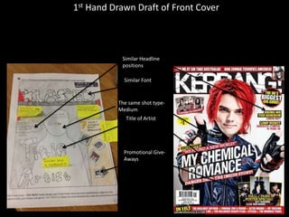
- 13. 1st Hand Drawn Draft of Front Cover Similar Font Similar Headline positions The same shot type- Medium Title of Artist Promotional Give- Aways
- 14. 2nd Hand Drawn Draft of Front Cover Similar Font Exclusive Headline The same shot type- Medium Title of Artist Quote from Artist
- 15. 1st Hand Drawn Draft of Double Page Spread Drop Capital Body Shots Quote Differentiated Questions
- 16. 2nd Hand Drawn Draft of Double Page Spread Similar Font Similar Headline positions The same shot type- Medium Title of Artist
- 17. Conclusion To conclude, the magazine I plan to create will contain rock artists specific to the rock music genre to show relevance and organisation to the target audience that is not used to this, this will make the magazine appear unique as rock music magazines are usually quite informal for their readership. The magazine will be called ‘Klashed’, the name is a derivative from ‘Kerrang’ which means not only will Kerrang’s readership and audience want to sample or even buy my magazine, but that our magazine is already meeting the demanding competition of Kerrang in the first issue. The colour scheme of Klashed is black and yellow. These colours connote the different types of rock music, this will help illustrate it to the Klashed readership and show the readership that there is more than one type of rock music covered and therefore appeal to a wider range of people.