Task 3
•Download as PPTX, PDF•
0 likes•160 views
The document analyzes the brand identity and mode of address of an issue of "Vibe" magazine. It summarizes that the magazine establishes its brand through consistent use of colors like black, white, and red in titles and images. The large bold fonts and prominent placement of celebrity photos aims to attract readers' attention. Overall, the magazine's style and serious facial expressions portrayed are meant to appeal to its target teenage audience.
Report
Share
Related slideshows

More Related Content
What's hot
What's hot (20)
Viewers also liked
Viewers also liked (19)
Similar to Task 3
Similar to Task 3 (20)
Recently uploaded
Recently uploaded (20)
Task 3
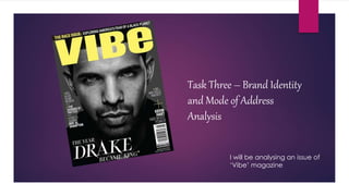
- 1. Task Three – Brand Identity and Mode of Address Analysis I will be analysing an issue of ‘Vibe’ magazine
- 2. Front Cover The front cover creates a brand identity by the colours and fonts used. The headline connects with the audience because they have made the font size really big and they have put it in yellow making it stand out from the rest. This cover story being written in white writing on the black and white background making it seem thoughtful. The colour scheme of the front cover being mainly black and white makes the masthead stand out more and the facial expression of the artist makes the mode of the magazine very serious and stern. The storylines of this magazine are key. They way they have wrote them in Serif font makes it seem more important and formal.
- 3. Contents Page This magazine uses a house style throughout by using the same colour scheme of black and white, like this background. The mode of address on this contents page is mainly focused on the fashion of the celebrity, they have made the image of the artist take up most of the page and they have used a medium long shot; this shot type makes the audience look at the artist and the artist’s fashion. Also the way the artist is standing gives off that he is laidback and stylish. Vibe often uses this on it’s other pages of the magazine like a house style; they do this to show that all of the content written in the magazine is from Vibe. The way they have written Vibe here is effective because the audience would look at it to see what it says because it isn’t clear.
- 4. Double Page Spread The colour scheme of this article is also red, white and black which is following the rest of this magazine. “LIFE OF A SHOOTING STAR!” would make the audience automatically read it because of how big it is compared to the rest of the text and the font and colour it is written in makes it stand out more. This image stands out to the audience because the writing on the side of his face makes it a viewpoint as well as the lipstick kiss mark. This image would appeal to the target audience of teenagers because of the informal word ‘SWAG’ on his face. This page also contains the ‘Vibe’ barcode looking image.
- 5. Overall Overall the mode of address used is to appeal to the target audience. The facial expressions of the celebrities on the front are all mainly the same; this would appeal because they make the magazine seem serious and as if the magazine has written something bad about them making you want to read to find out. The colour scheme used are appealing to the audience because they always use black and white and either red or yellow. The mode of address this gives to the audience is serious and masculine.